Friday, October 24, 2014

Monster Month Day 14 - Gojira


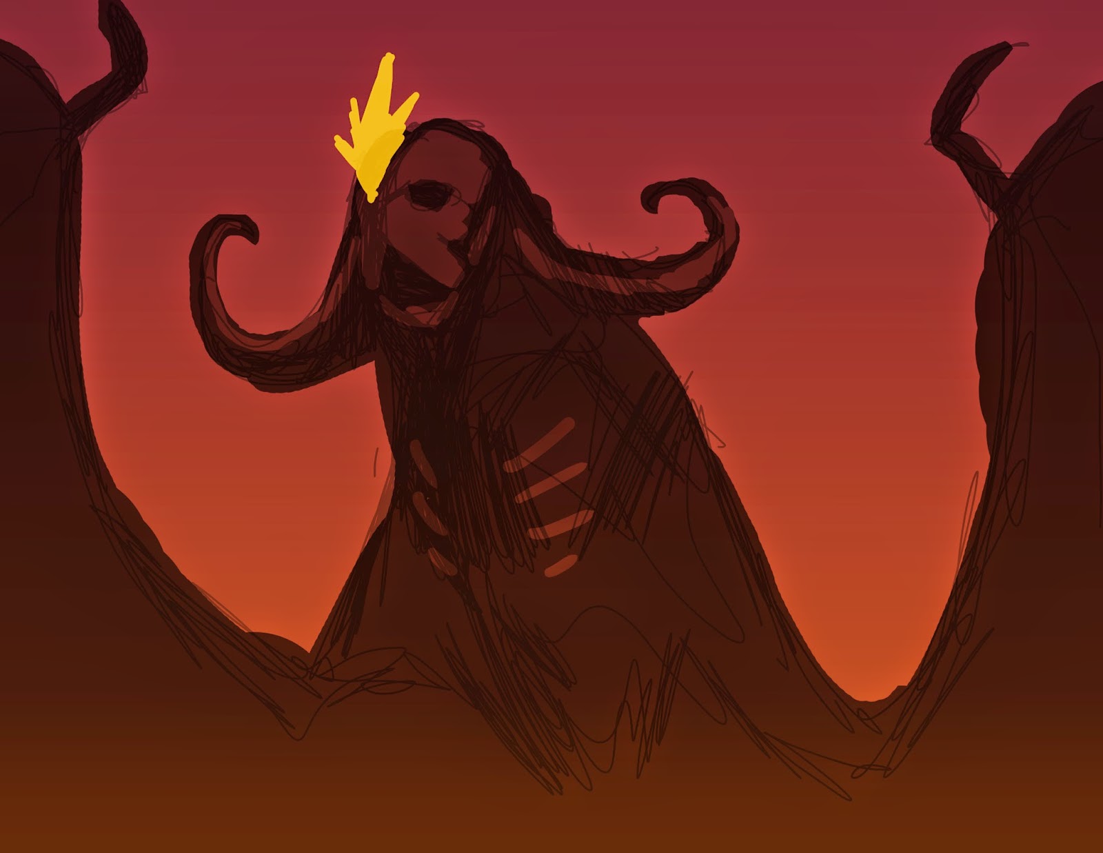
King of the Monsters! I tried a couple other poses and quickly realized that Godzilla should always be seen from below. This is more or less the version from the recent remake.

Thursday, October 23, 2014

Monster Month Days 11-13 (more 80's classics)


Gremlins (1984) is tied with Home Alone (1990) as my favorite Christmas movie and is easily one of my top 10 favorite films of all time.


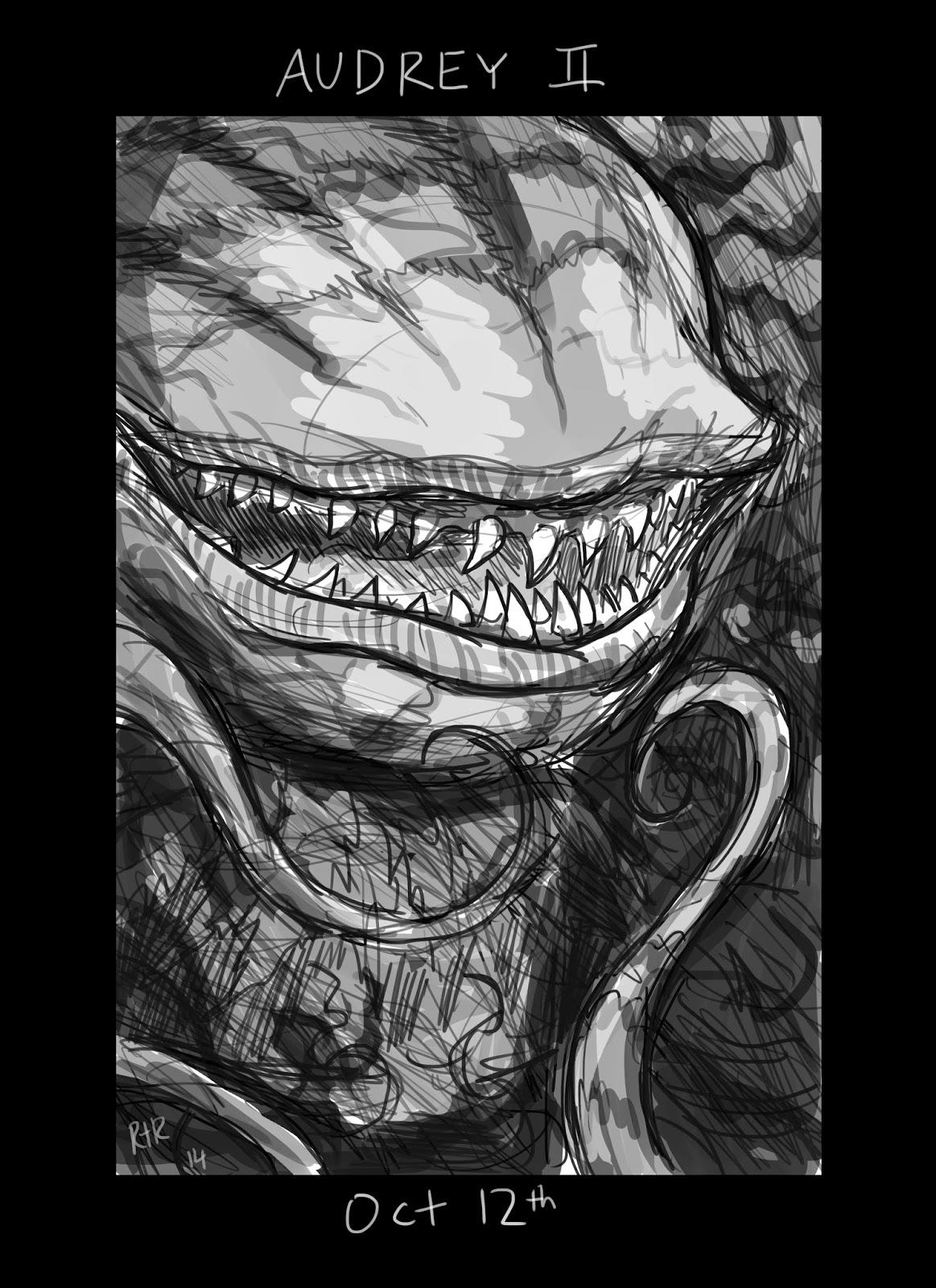
I always forget how much I love "Little Shop of Horrors" (1986). What ever happened to Rick Moranis?


Little bit of trivia: Bill Murray's masochistic dental patient character was played by a young Jack Nicholson in the original 1960 version. For most people, the dental scenes are probably the scariest part of the movie.


If you know me, you knew this was coming... Stay Puft from the first Ghostbusters (1984)! Although, to be honest I was far more terrified of Vigo the Carpathian and the pink slime from Ghostbusters 2.


Wednesday, October 22, 2014

Monster Month Day 10 - The Fly


Was going to draw the super disgusting "Brundlefly" from the 1986 Jeff Goldblum version of "The Fly", but then I remembered the original 1950's version of the Fly wore a suit, which was just too adorable to pass up.

Tuesday, October 21, 2014

Monster Month Days 7-9 - 80's Sci Fi Classics

Trying to catch up. Everyone's favorite sci-fi monsters from the horror renaissance of the 80's(ish). Stuck close to the original designs on these since they are trademarked characters (as opposed to creatures from mythology or literature). Change Predator too much and he's not really Predator.

1979
 Wanted to include a facehugger, but had to hurry things along.

1987
1984
Not sure if the fleshy eye works on this but I wanted to make it clear that this is THE Terminator and not just any endoskeleton.

COMING SOON - More awesome monsters from the 80's!

Wednesday, October 15, 2014

Monster Month Days 1-6

I decided to sketch a monster for every day of October a week into the month, so here's the first set as I attempt to catch up. Obviously these are my takes on the classic "Universal Pictures" movie monsters. First is my version Dracula (not just a generic vampire). The creepiest part of the book is when he crawls down the side of his castle. At this point he isn't fully rejuvenated so he still looks pale and ghoulish.


Next is Frankenstein's Monster. He's a tough one because the iconic Boris Karloff version is nothing like the monster in the book, who complains of his creator's rejection in eloquent monologues while his long black hair blows in the wind. So emo.


Never seen the movie, but in the book the monster begs Victor Frankenstein to create a mate for him (which he doesn't, inspiring the monster to murder Vic's fiance). Stuck close to the movie version.


Not really happy with this one. The WolfMAN is man whose evil, beastly is manifested in physical form. That's more scary than a man who is trapped inside the body of a wereWOLF. It's hard to find the balance between animal and human features and this didn't turn out the way I wanted but I had to press on.


My favorite classic monster simply for how bizarre he is. While the other monsters have roots in myths and classic literature, the Gill Man just sort of comes out of nowhere. Prehistoric fish man wants to steal your girlfriend - why?


I think this is a pretty good sketch, but the Mummy is still kind of a boring monster.


Wednesday, September 24, 2014

Batman meets ???

Get ready for awesomeness.
Rough page for a new portfolio piece. No photo references used, which is why Frank Miller Batman in panel 1 transforms into Jim Lee Batman by the 4th panel. Will fix it as I tighten the line art.

Thursday, September 11, 2014

JOB Test Pages

Some test pages for my barely-an-idea JOB graphic novel. Still struggling to find the right artistic style and color palette for this. The line art for the pages below is very rough and the colors are way too "Technicolor". You can definitely feel the Mike Mignola influence, but I'm considering eventually painting over the final line art to end up with something more like Francisco Goya doing a comic book.


Tuesday, September 9, 2014

Mucous Man WIP 2

little more work, big difference

Friday, September 5, 2014

Mucous Man WIP

Here's where about a year of practice has taken me. I'm still working on the repaint, but is it any better?

original digital painting 7/11/13

repaint WIP 9/5/14

Tuesday, September 2, 2014

The Date Thumbs

Here's an example of what I mean by "thumbs" - small sketches (maybe 2" tall?) where I figure out the page layouts. When I get stuck, I usually use a 9 (3x3) panel grid like famously used by Dave Gibbons in Watchmen to help me figure out the "shots" i want, before I worry about the best way of fitting them together on the page for maximum impact.


Monday, September 1, 2014

"The Date" p1-6 WIP

At the beginning of the year I set myself a goal of completing a page of comic book art each week. With only a quarter of a year left, I'm way behind. In order to catch up, I'm posting some very rough, unfinished pages I've been working on. This is meant to eventually be a portfolio piece for the big publishers Marvel and DC.

p1
 As you can see, there are several layers of lines. I draw in black and then use an adjustment layer to change the hue to blue to draw over the top, refining and refining until I'm happy with the lines (I never am). The orange is for background stuff, especially when I use a grid for perspective.

At first this might seem like a simple scene, but I probably drew about 20 rough thumbnail size sketches of the layout. At first I was going to start with a wide shot of the cafe, but since the setting isn't important to the plot (they could just as well be at a fast food joint or library), I decided to start with a two shot giving the two characters "Parker" and "Stacy" equal importance. Yes, they're intentionally hipster versions of Peter Parker and Gwen Stacy.

p2
Very rough digital lines, not happy about the layout on this one. That face in the first panel is horrendous. Basically, this is supposed to play as a reversal of the cliche "Clark Kent runs away in fear, but is really just changing into Superman", but it's not working yet. Because the twist is...

p3
 The superhero is the girl with the mohawk. Her powers are supposed to be based on the control of gravity. Need to add some bricks or something so you can tell she's running through a back alley.
p4
Most of the layouts started as small pencil sketches done at work. Here you can see how I blow 'em up & blue 'em before I start drawing digitally.

p5
I kind of like how the monster can't fit in the page, but I also think this should be a 2-page spread, so you can see more of the city, people fleeing in terror, the creatures legs smashing cars, etc... Sometimes I do sketches in grayscale just to get a better feel for the composition.
p6
Not sure if this page layout works? Sort of a weird sequence of shots, with the characters moving in a circular motion.

Lots of work still needs to be done before I'd feel confident showing this to an editor at a comic book convention. Sometimes I need to abandon things for a while and come back with fresh eyes. These six pages represent several months worth of sporadic noodling and including the Hellboy drawing and the Spider-Man commission, I'm now only three 3 months behind.

Monday, August 25, 2014

Washington. Washington.

He's coming, he's coming, he's coming...

Saturday, August 23, 2014

Thursday, August 21, 2014

Spidey More WIP

final(ish) line art

flat colors
The thing I'm most proud of is the "spider face" hand. Believe it or not this is the first time I've actually finished a drawing of Spider Man swinging through the city. One more step to go.

Wednesday, August 20, 2014

Spidey WIP


My loose sketches always seem to have more personality than the final lines. Always struggling to find the balance between realism and cartooning - the longer I work on a piece, the less I like the artistic choices I've made. I need to try spending an entire Saturday drawing something in one sitting instead of fiddling around for an hour each day. Actually I'm having fun with this piece, despite having to draw buildings.

Saturday, August 2, 2014

Cobrachiosaurus


Behold the mighty cobrachiosaurus. This somewhat aged digital doodle is the result of one of my first attempts drawing with the Wacom tablet. The creature design is for the "Stick Man" comic.


Friday, August 1, 2014

Spidey Redesign pt.2

line art

color flats

final colors


Tuesday, July 8, 2014

Spider Man Re-Design Process

original design
Commissioner wanted a "turn around" of Spider Man based on this design I did a few years back for a contest. Or so I thought...
mask and glove ideas
Ended up with a lot of changes. Most of the details on this design came from the commissioner, who has been very specific and supplied a lot of references. My only real contribution to the look is the "spider face" gloves.
web shooter, boots, spider logo
Webs radiating out from the spider on chest look cool here, but they direct the viewers eye away from the face, which I find distracting. I like the idea that the web shooters have triggers that look like legs and spinnerets.
back designs
My original back design was bugging me (no pun intended) because it reminded me of Galactus' helmet. 
"inking"

color options
nearly finished line art
 Still needs some minor (hopefully) tweaking and adjustments, but this is more or less what I'm calling the final line art. The guy who requested this is way specific about the proportions (he even sent me YouTube videos about rock climbers with "ape" proportions) so I slimmed him down a little compared to the version above.

This is only a small taste of the amount of work that has gone into a $25 commission.