Showing posts with label sketch. Show all posts

Monday, April 25, 2016

ECCC 2016 Follow Up Part 1

This year for Emerald City Comicon I drew a short ghost story, inspired by real life, that I hoped would demonstrate my strengths and be a welcome change of pace from all the superhero samples I imagine other aspiring artists are showing. The pages I did can be found on my Tumblr here: Stray Cat

In 2015 I got a lot of positive feedback and useful critique of my work, but instead of going back and redrawing those pages, I moved onto some sample pages for Marvel that I was completely unprepared for. In the interim from then and now, I practiced breaking down scripts into layouts, worked a little on my anatomy and did a whole bunch of sketch requests and commissions... basically, I wasted a year trying to prove how prolific of an artist I could be, without finishing much actual sequential art. That year I was looking for validation, but this year I wanted more direction. Thankfully I got some.

Before I continue, I want to thank several of the creators who went above and beyond to help me improve as an artist, giving valuable advice and often panel-by-panel suggestions on how I could improve the clarity of my art, both stylistically and narratively. This year Benjamin Dewey, James Harren, David Marquez, Tony Parker, Simon Roy, C.B. Cebulski, Neal Adams, Ryan Ottley, Kris Anka, Ibrahim Moustafa, Adam Gorham, Skottie Young, Farel Dalrymple, David Walker, Sanford Greene & many others all took the time to pass on some of their knowledge to me. I thought I'd share some of this for any other aspiring comic book artists who stumble upon my (recently resurrected) blog.

Several artists said that the first panel was a nice enough establishing shot, but that there was a disconnect between panels 1 and 2, so far as tracking which figures were which. Also some perspective issues. To correct this, I did some quick sketches of the location (the St. Regis travel center in western MT) using other photo references from Google.


I found a reference I liked a little bit better than the original and used it to rework the first two panels. First is the original version, the second image is still a work in progress, but even in its unfinished state represents what I hope is a step forward.
original page 1

revised
One thing that surprised me is that a lot of people criticized my font choice and suggested letter by hand. I had added the dialogue because I wanted to present this as a finished project and show off my writing to those who had time to read it. It never occurred to me that the lettering would detract from the art, but it was a welcome reminder that EVERY DETAIL MATTERS.

You can see that I've also started to simplify the line art, getting rid of a lot of the cross hatching. My natural impulse is to scribble all over everything and I enjoy the work of a wide variety of artists, whose styles range from very restrained and minimalistic (Mike Mignola, Jeff Smith) to very frenetic and busy (Sergio Toppi, Bill Sienkiewicz). One thing that Benjamin Dewey and others have repeated is that every line must serve a purpose. TO WHAT END am I putting each mark on the page? I had a minor epiphany after he sketched this for me:
sketch by Benjamin Dewey
Burlap sac vs pillow. Same basic shape, but a few simple lines communicate the difference in texture and therefore function. Multiple artists pointed out that if I'm including grayscale, there's really no reason to use cross hatching for shading - it's redundant. The only marks I need are those necessary to convey form or imply texture. Below are some attempts to put that into practice.


I think I still lean more towards the heavily rendered version, personally, but are all those extra lines actually communicating anything that the more simplified version isn't? This comes down to a matter of personal preference and it's something I will probably be experimenting with for the rest of my life. Since this is a ghost story based in part on a real life event, I believe the more realistic I can make it the better - it serves the story to exaggerate every pore on his nose, every stray whisker on his beard, because I want the reader to feel like they were right there with me.

It seems like a lot of artists labor over developing their own style. I've never really been conscious of my own struggle to express myself because until recently drawing was just something I did for fun, without any voices other than my own saying "what if you did this?" Recently I've found it difficult to harmonize my disparate influences - I try to simplify and it looks like a lifeless coloring book; I try to loosen up and looks sloppy and unprofessional. In order to move forward, I've sought to educate myself more seriously in the art of comics and to take a more analytical approach to my own drawing. I feel like I have a lot of catching up to do, but I have no deadlines. There's no rush to prove I can "finish" something in a certain amount of time and I don't need to pander to some imaginary fan base. This year I'd like to take more time to think about what and why I'm drawing, so that instead of having over a hundred hasty sketches of random crap at the end of the year, I have a handful of finished story pages I'm actually proud of.

Thanks to all the family, friends and brief acquaintances who've inspired and encouraged me to pursue my passion for storytelling over the last few years. I appreciate any feedback I can get!
-RtR

PS - I'm going to try to make these posts a weekly thing on Mondays, we'll see how it goes.

Tuesday, September 2, 2014

The Date Thumbs

Here's an example of what I mean by "thumbs" - small sketches (maybe 2" tall?) where I figure out the page layouts. When I get stuck, I usually use a 9 (3x3) panel grid like famously used by Dave Gibbons in Watchmen to help me figure out the "shots" i want, before I worry about the best way of fitting them together on the page for maximum impact.


Friday, June 27, 2014

Commissions!

Scribblog now has a Pay Pal gadget that allows you to purchase a digital sketch of any character, creature or random thing you want (keep it PG-13). During payment, make sure you include a description of what you want me to draw int he "note to seller" box. There are currently three options: $5 for a black and white sketch (line art), $10 for an illustration with flat colors and $20 for a fully rendered digital painting. The final art will be posted on this blog. If you have a special request that doesn't fit into the payment options, let me know and we will work something out. Below are examples of the first two options. Also check out the previous post for an example of $10 and $20 options.
$5

$10

In case you're wondering, that's Slash from the classic Teenage Mutant Ninja Turtles cartoon/comics/video games.

Sunday, May 4, 2014

Stick and Stone

Here are the original pencil sketches of the pages I posted.
p5 sketch
p6 sketch
The design for Stick's new friend/pet/transportation come about fairly easily. These are the first few sketches I did of him and as you can see I got the basic design down fairly quickly. Part turtle, part armadillo, with a bit of eel in the face. I kind of like him standing more upright.

designs for "Stone"

Saturday, May 3, 2014

Stick p5-6

Next two pages of "STICK". Embarrassingly sloppy, but I'm way behind on my goal of drawing a comic page each week this year and trying to catch up. I'm about two months (6 pages) behind!

p5

p6

Sunday, April 13, 2014

Sketch #17

Carnage & Shriek for Jenji

I wanted to draw the Spider-Man Doppleganger also, but I quickly got frustrated trying to figure out how to draw all those limbs and webs... I always loved that wacky character. Maybe some other time.

Thursday, April 10, 2014

Sketch Requests #14-16

Everest Daydream for Daniel

Tiger Princess for Tamara

Vintage Mustang Cafe for Dad

Sunday, April 6, 2014

Sketch Requests #12, 13

Funny that these ones were requested back to back. Super heroes and super pets!

For Greta Kastner
Greta - For some reason I had a really hard time with this one - I redrew it several times and I'm still not completely happy with it, but I want to catch up so hopefully it turned out all right!

For Stephanie Robino

Sunday, March 2, 2014

Bill vs Chupacabra pages 1-5

  
p1

p2

p3

p4


Mama Cabra!

Every page I've done has been an experiment in defining a "style"/work flow/methodology. I plan to come back to these later to tighten them up and color them. Please give me your honest critique - point out everything I've done wrong before I take these to the "inking" stage. Pacing, anatomy, rendering, inconsistency - if you spot something that bothers you, let me know! Also, if there's anything you think turned out good, I wouldn't mind hearing that either.

Below is a small example of the many design sketches I did to design the "Mama" Chupacabra. The two in the top left are fairly recent, the one in the bottom right was done a few years ago. I think the expression of the guy in the middle is the best.


Thursday, February 20, 2014

Monday, February 17, 2014

Saturday, February 15, 2014

B-Day Sketchbook 5-6

Not sure if the layout works for this one, but I'm trying to get these done in a timely manner, so... good enough. Good grief Mom.

Magical Mojo Forest Fantasy for Mom

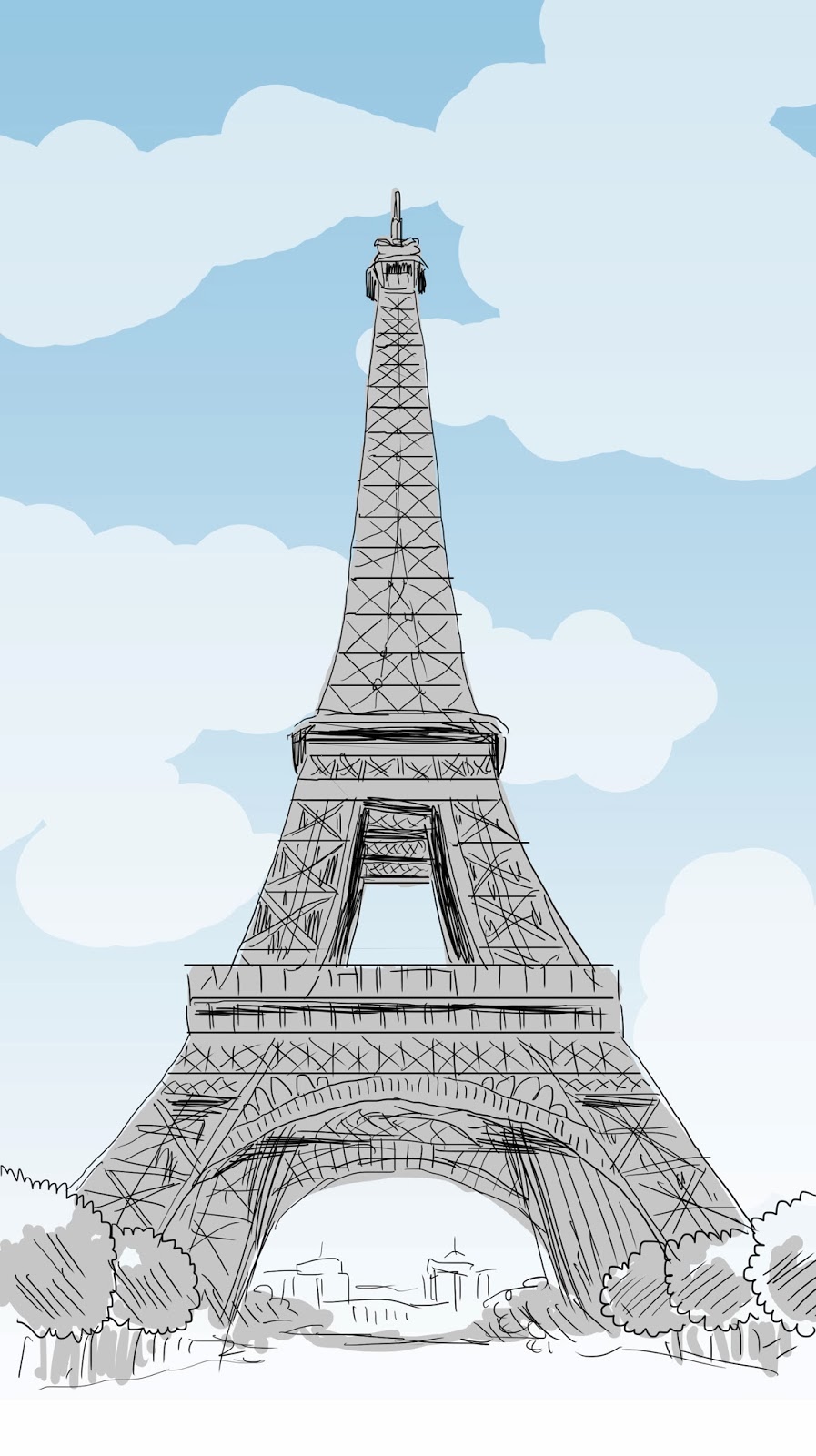
Apologies to whoever took the Eiffel Tower photo I basically just traced.

Eiffel Tower for Deliza

I've always had an irrational fear of drawing buildings (which I'm going to try to conquer shortly), but monsters on the other hand...

Eiffuh... AIEEEEE!

Saturday, February 8, 2014

B-Day Sketch #4

Unicorn for Purp Carey

Thursday, February 6, 2014

B-Day Sketch #3

Okay, so consider this a warning. Ask me to draw something like this: 
A lumberjack from the future (ie. human but with machine body part upgrades), extremely hairy, some hairstyle from the future, and it wouldnt hurt if his nametag had the name "Jake" or some cooler futuristic version of the name Jake hahaha.. Also, wouldnt hurt if you subtly showed the effects of our worlds pollution on the wildlife habitat...

And you're going to get something that looks like this:
Robo-Lumberjack for Jake Brenneman
Apparently I imagine manly-men in the future styling their hair in the fashion of Ace Ventura: Pet Detective.

Tuesday, February 4, 2014

B-Day Sketch #2

Octopus Drummer for Mike Ginn
This was fun. Probably one of the most technically complex things I've attempted to draw, so pardon the roughness of the sketch. Confession: I drew over a picture of Terry Bozzio's ridiculous drum kit.

Monday, February 3, 2014

Birthday Sketchbook #1

Sandy Koufax for Uncle David

Monday, January 27, 2014

Dot Lion Attack


Sketch for page 4 and some different designs for what I'm calling the "dot lion". Not sure if the design I settled on is the most exciting, but I can't use up all my wackiest designs right out of the gate.


Sunday, January 26, 2014

Stick Pages 3-4


More finished lines for page 3 and page 4. As you can see I'm experimenting with a grayscale "marker" look in this last page I've done. I think it helps bring this page to life (or death?) a bit. Let me know what you think!


Saturday, January 25, 2014

Yoda Sketch

Sketch I did for my Dad's birthday. When fifty years old you reach, look as good you will not.

Sunday, January 19, 2014

Stick p3 (rough)

Amanda and I decided to make a ski/board trip this weekend, so I won't have time to finish this weeks page. So here is rough line art I've completed so far and below it is the original Walmart sketch.