Monday, March 10, 2014

Composer Series - Olivier Messiaen

This is the second piece in a series of paintings of my favorite composers with animals representative of their music. The first piece was of John Zorn (I suppose I should post that one as well). This is French composer Olivier Messiaen (1908-1992), who transcribed bird-song for solo piano and wrote a "Quartet for the End of Time" while a prisoner during WWII. He also experienced synesthesia - perceiving sound as color and sounds from colors.
Rough Sketch

Painting in Progress

Final Painting
I'm planning on doing Ennio Morricone or Koji Kondo next.

Sunday, March 9, 2014

Hellboy's 20th Birthday


Didn't get a comic page done this week because I was working on these submissions to Multiversity's 20 Years of Hellboy art contest. These are two parts of a triptych (the third will depict Hellboy in Hell). Compared to the epic Gustave Dore inspired lineart of the second, I don't think the first holds up so well, although I do love drawing kid Hellboy. I think the second drawing is probably one of, if not the best illustration I've ever done.

Sunday, March 2, 2014

Bill vs Chupacabra pages 1-5

  
p1

p2

p3

p4


Mama Cabra!

Every page I've done has been an experiment in defining a "style"/work flow/methodology. I plan to come back to these later to tighten them up and color them. Please give me your honest critique - point out everything I've done wrong before I take these to the "inking" stage. Pacing, anatomy, rendering, inconsistency - if you spot something that bothers you, let me know! Also, if there's anything you think turned out good, I wouldn't mind hearing that either.

Below is a small example of the many design sketches I did to design the "Mama" Chupacabra. The two in the top left are fairly recent, the one in the bottom right was done a few years ago. I think the expression of the guy in the middle is the best.


Saturday, March 1, 2014

B-Day Sketches 9, 10, 11

Russell Wilson for Aunt Lisa
Spidey vs Sinister Six for Cordell
Brain Escape for Melanie Schliebe

Sunday, February 23, 2014

Bill v Chupas p4

I'm not sure why Bill beating the crap out of these little goat suckers cracks me up, especially the one he punches in mid air. Probably got the idea after watching this video a few years back.

Hey how'd that farmer guy get upside down?

Thursday, February 20, 2014

Monday, February 17, 2014

Sunday, February 16, 2014

Bill vs Chupas p3

A fun but slightly more involved page layout. The line art is still sort of a mess, but I have to keep posting a page each week and moving on to break the bad habit of redrawing the same page over and over again. Yes I know his tranquilizer gun disappeared in the bottom panel, I will have to draw that in later.


Saturday, February 15, 2014

B-Day Sketchbook 5-6

Not sure if the layout works for this one, but I'm trying to get these done in a timely manner, so... good enough. Good grief Mom.

Magical Mojo Forest Fantasy for Mom

Apologies to whoever took the Eiffel Tower photo I basically just traced.

Eiffel Tower for Deliza

I've always had an irrational fear of drawing buildings (which I'm going to try to conquer shortly), but monsters on the other hand...

Eiffuh... AIEEEEE!

Sunday, February 9, 2014

Bill vs Chupa p.2

Experimenting with different rendering techniques in Photoshop. I've been toying around with this little story idea for a while now. I love drawing the chupacabra, I've got a lot of sketchbook doodles of him. He's sort of a mix of bush baby, vampire bat and feral cat. Below is the original second page from a few years back, drawn in pencil.


Saturday, February 8, 2014

B-Day Sketch #4

Unicorn for Purp Carey

Thursday, February 6, 2014

B-Day Sketch #3

Okay, so consider this a warning. Ask me to draw something like this: 
A lumberjack from the future (ie. human but with machine body part upgrades), extremely hairy, some hairstyle from the future, and it wouldnt hurt if his nametag had the name "Jake" or some cooler futuristic version of the name Jake hahaha.. Also, wouldnt hurt if you subtly showed the effects of our worlds pollution on the wildlife habitat...

And you're going to get something that looks like this:
Robo-Lumberjack for Jake Brenneman
Apparently I imagine manly-men in the future styling their hair in the fashion of Ace Ventura: Pet Detective.

Tuesday, February 4, 2014

B-Day Sketch #2

Octopus Drummer for Mike Ginn
This was fun. Probably one of the most technically complex things I've attempted to draw, so pardon the roughness of the sketch. Confession: I drew over a picture of Terry Bozzio's ridiculous drum kit.

Monday, February 3, 2014

Birthday Sketchbook #1

Sandy Koufax for Uncle David

Sunday, February 2, 2014

Bill vs Chupa p.1

Depending on the size of your monitor you may want to open the image in a separate window for a better view.

Bill the Platypus vs. el Chupacabra
Page 1

Bill the Platypus is a character I created in the 2nd or 3rd grade. Originally just a cartoon platypus, he has evolved into a tribute to the great 90's cartoons I grew up with like Ninja Turtles and Darkwing Duck, which were themselves parodies of the nitty-gritty comics of the 80's. He is a bounty hunter who specializes in the capture of illegal human-animal hybrids. One big source of inspiration is Mike Mignola's Hellboy. I always like how in the comics, nobody ever blinked at a big red devil showing up to exorcise their house. Bill sort of works that way - he's a ridiculous looking character in an otherwise realistic world.

Traditionally in comic books there is a penciling stage, an inking stage and a coloring stage, done by three different artists. In an all-digital workflow, these stages all sort of blend together. The lines are dark like inks, but the drawing is still a bit loose. Artists working in pencil often sketch in blue (which doesn't show up on a photocopy) then draw tighter lines on top. In photoshop, it's as simple as applying a special adjustment layer and drawing over the top, as many times as needed to get the line art to where it needs to be.

This is a page I've drawn before, in pencil. Here's the original scan from a few years back. Contrast got a boost and lettering was added in Photoshop. I used this as the base layer.

Original Pencils


Monday, January 27, 2014

Dot Lion Attack


Sketch for page 4 and some different designs for what I'm calling the "dot lion". Not sure if the design I settled on is the most exciting, but I can't use up all my wackiest designs right out of the gate.


Sunday, January 26, 2014

Stick Pages 3-4


More finished lines for page 3 and page 4. As you can see I'm experimenting with a grayscale "marker" look in this last page I've done. I think it helps bring this page to life (or death?) a bit. Let me know what you think!


Saturday, January 25, 2014

Yoda Sketch

Sketch I did for my Dad's birthday. When fifty years old you reach, look as good you will not.

Sunday, January 19, 2014

Stick p3 (rough)

Amanda and I decided to make a ski/board trip this weekend, so I won't have time to finish this weeks page. So here is rough line art I've completed so far and below it is the original Walmart sketch.


Tuesday, January 14, 2014

Pokemon Redesign Process - Drapion

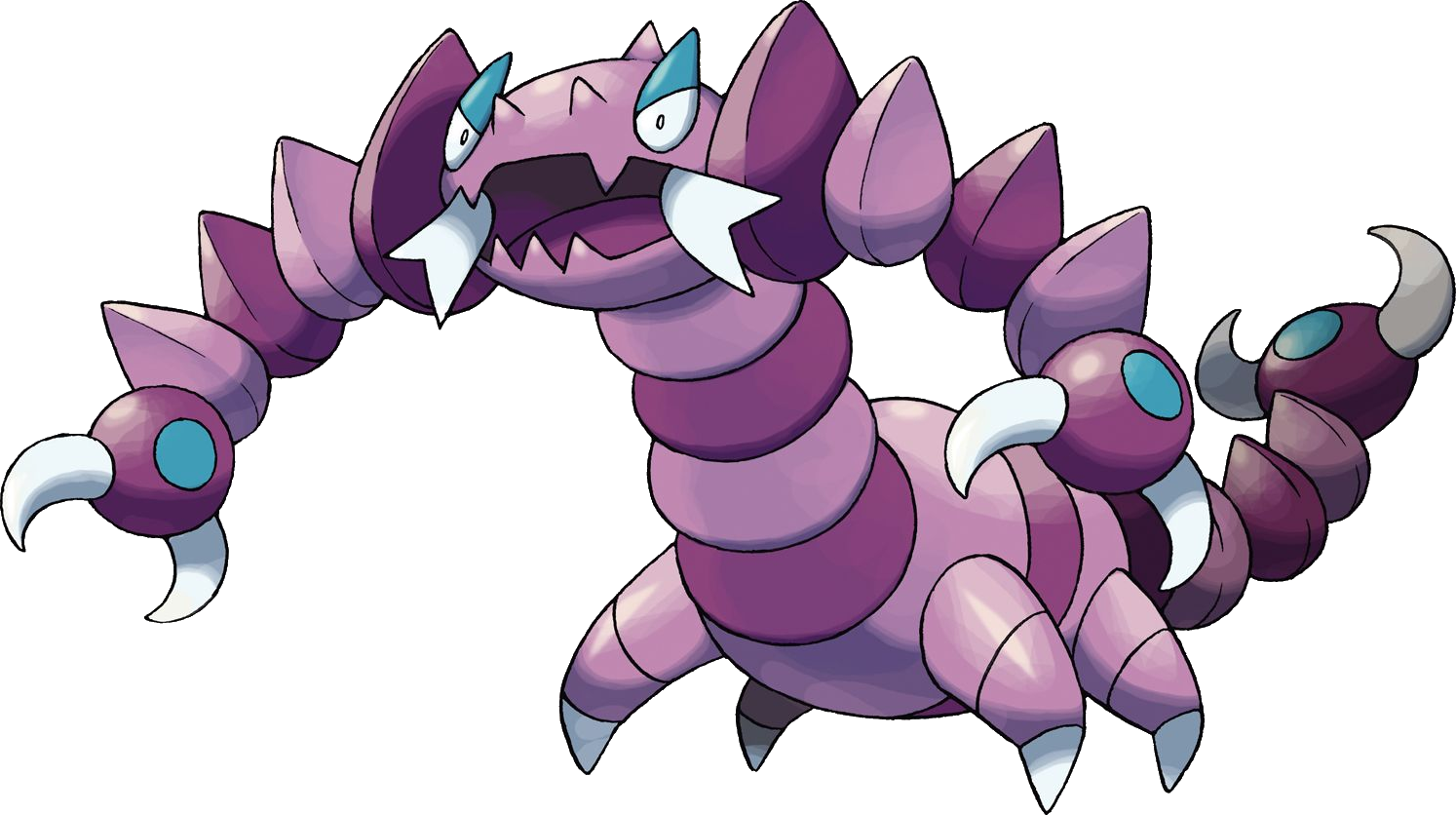
For many years now I've been periodically redesigning Pokemon in a semi-realistic style. Originally started in high school, I made it through the original 151 and have been doing a few here and there since then based on requests. Here is a look at my current process, starting with the original Pokemon.
Drapion
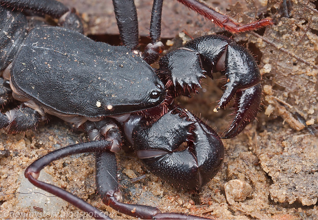
Next I grab a few photo references of animals I'd like to base it on. Here's an example, usually I use about five.
Whiptail Scorpion, up close and personal
I start drawing very loose, using an adjustment layer to lighten up the lines as I draw on top. I'll usually starting painting in the flat colors under the sketch, then refine the lines over the top.
Rough sketch
Refined color lines (dodge/burn)
Painted with colors from original Pokemon art.
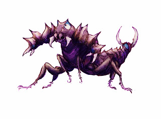
At this point I'm not really working linearly any more, just painting, playing around with layer settings, different brushes, etc... until I get to something approaching realism. I'll usually start painting with colors picked from the photo refs and adjust transparency to find something in between.

Uglier, more realistic color layers.
Finally, I throw on some adjustment layers to give the image a little more impact. Since I'm not going for photorealism, I usually bring back more of the color and contrast lost in the earlier stages. Here's the final image. Sometimes I'll paint a background if I really like the Pokemon I drew.
Adjustment layers (levels, gradient maps)

Monday, January 13, 2014

Stick p2 Sketchbook

Again, I prefer the overall feel of my rough sketches more than my digital inks, but they're just too rough to pass off as "professional". I just need to keep working to get better at drawing digitally. I've never really liked real inking either, it's slows down my drawing and the lines always look wobbly to me. I do like how the final ferns turned out compared to the simpler bushes below.


The toothy creature is simply called a "Dot" - it's sort of like a piranha frog. Anybody who knew me in elementary school should be getting a kick out of this. Notice how it's got four limbs above and below I tried out several ideas before deciding to go with the simpler pair of legs. I may use the spider guys later. Also below are my rough thumbnails and again all these sketches were done during my breaks at Walmart.


Hope you've enjoyed these first few posts, I'm hoping to hit my stride the next couple weeks, when I'll need to occupy my time while Amanda gets buried in school work.
-RtR

Sunday, January 12, 2014

Saturday, January 11, 2014

Scraps from the Past - Moses

I enjoy drawing characters from the Bible. I've done many illustrations over the years for the Show and Tell Bible, starting with the Exodus in high school, Judges & Ecclesiastes in college. I'm currently working on the Gospels. Moses is one of my favorite characters, perhaps because he's one I'm so familiar with.

Here is an example of how I drew him for the Show & Tell Bible while I was in high school (2004-06).


Anime hairdo, deformed arms and  legs; it's sort of embarrassing to look at, but keep in mind this was drawn nearly ten years ago!


Here's an example of a sketch I did of him a couple years after graduating college, in one of my infamous Walmart sketchbooks. Pencil and fine Sharpie pen. I wish this was the Moses I'd been drawing for the Show & Tell Bible.


Here is a very quick sketch I did tonight in Photoshop with my Wacom tablet. Based on still from "The Ten Commandments" with Charlton Heston, although I picture Moses' appearance/demeanor somewhere between Morgan Freeman and Clint Eastwood. The older sketch is arguably drawn better, but I've been trying to refine a more stylized approach to my character line art. Let me know what you think.

Wednesday, January 8, 2014

Stick Page 1 Sketches

I was going to draw this Stick Man comic in a regular comic book format, but since I originally had wanted to do this as a weekly, year-long web comic, I thought the horizontal format would work better on computer monitors. Then again, most people use cell/tablet devices nowadays so the vertical format might have worked alright as well.


These sketches were done in pencil during my lunch breaks working at Walmart. As you can see, my original line art has a much more organic, energetic feel to it. I scanned it and traced in Photoshop using my Wacom tablet. I'm hoping that eventually the "feel" of my digital work will match the look of my pencil art, with the flexibility of cleaning it up a bit and adding color without worrying about making a mistake.


Stay tuned for page 2 on Sunday!